This Design Sprint was a modified version of the Google Ventures Design Sprint, specifically for 1 sole designer to perform the sprint alone, with supporting user research provided in the brief.
GramCity is start up company offering a photo editing app that helps users easily make their photos look amazing before sharing them on instagram or other social media platforms.
5 Day Design Sprint for GramCity

Methodology.
The Google Ventures Design Sprint is a five-day process for answering critical business questions through design, prototyping, and testing ideas with customers. It is the “greatest hits” of business strategy, innovation, behavior science and design thinking packaged into a battle-tested process that any sized team can use.
The process follows:
Day 1: Understand the issue and map out the problem. Identify the target for the sprint and create ‘How Might We’ questions.
Day 2: Sketch solutions on paper.
Day 3: Make difficult decisions and turn ideas into solutions to be tested.
Day 4: Create a high-fidelity prototype.
Day 5: Test the proto with 5 potential customers
Day 1: Understand & Map The Problem.
Understand the problem space
User map of possible end-to-end user experience
The Problem Space.
The design brief is to help GramCity explore how and where they could help their users find great photo ops near them.
This includes tourist attractions, architecture, art, and anywhere someone could take a great photo.
GramCity wants to design a feature to help users find and share excellent places to take photos, wherever they are.
The solution should be designed as a feature for the GramCity mobile app.
GramCity wants to help users find physical places and locations.
GramCity wants to create an active community of users who find and share their favorite locations.

The Goal.

The goal is to develop a feature of the GramCity mobile app that helps its users find physical locations for great photo taking. It will achieve this by creating an active community of users who find and share their favorite locations with other users.
My Role In This Project.
I was the lead and solo designer in this project.
I synthesized the research, designed the solution and prototype, then tested it on potential users.
User Insights.
User research showed that there were different types of users with different degrees of things they sought from the experience of finding and taking photos.
Responses ranged from popular touristy places to hidden gems and personal preferences. Also, users varied between venturing on an unplanned path with no intention to travel for photos, which contrasted with those who researched early and were willing to travel far for photo ops.
There were 2 main personas identified from the various user research insights gathered. These personas are Nick and Sarah.

Personas.
Persona 1: Nick.
24 yrs old
Video Editor
Los Angeles, CA
Nick takes road trips to new cities at least 5 times a year. He loves traveling, documenting his trips, and sharing his photos- either on social media, or in group chats with his friends.
When in a new city, Nick likes to make the most of his time there- he’ll walk and explore for most of the day, and doesn’t have a strict plan or itinerary.
Nick always regrets when he doesn't take enough pictures, but he also feels like he’s missing out on the travel experience if he’s constantly on his phone taking photos.
Nick tries to snap a few photos of the different things he’s doing, but he feels like he may have missed out on some good photo ops that were already near him.
Nick wants to find great places to take photos to document his trips, but doesn’t want to spend time researching or traveling out of the way to find them.


Persona 2: Sarah.
27 yrs old
Event Production Manager
Chicago, IL
Sarah travels a lot for her work, and spends a lot of time in new cities with time to spare between the events she’s working on.
Sarah spends most of her free time taking photos, after taking a photography class a few years ago.
Before visiting a new place, Sarah spends some time looking up photos on Instagram, Pinterest, and other social media sites to get inspiration for photos she wants to take on her trip.
Sarah thinks about the photos she wants to take, and plans her day around that.
Sarah doesn’t spend a lot of time in one city, so she wants to get the best possible photos when she’s there. She doesn’t mind spending time traveling to the places for a great photo- but if the place isn’t what she expected, she feels like she wasted her time.
Sarah has to spend lots of time looking through other people's photos to find places she wants to go. If it’s a lesser known place, finding the address or details on the location can take a lot of time to research.
Sarah likes to see the different ways people take photos of the same place, but it’s time consuming to scroll through lots of ‘average’ photos to find a few good ones.
Sarah wants to easily find locations and examples of the best photo ops in a city before planning out her day around visiting them.
User Flow.
A map of a possible end-to-end user experience was drawn to help identify the steps to take the user to the end goal. Initially I had 2 main routes and goals but upon rereading the personas (in particular Nick’s frustrations) I decided to add a third user flow to achieve the goal of discovering a location by notification when you happen to be near it, which doesn't involve the user actively searching.

‘How Might We?’ Questions.
By reframing the challenges as ‘how might we’ questions, I turned them into opportunities for solutions.
How might we help users efficiently find great locations for taking photos to their personal liking and preferences?
How might we help users thrive in a community of shared photos and locations?
Day 2: Sketch The Solution.
Lightning demos of inspirations
Crazy 8s exercise
Solution sketch
Lightning Demos.
I researched some great solutions from other companies and industries for inspiration.
I chose Google Maps, Yelp, Pinterest and Instagram.
Google Maps.
The most popular app used for when people search for location, Google Maps has an array of photos from locations around the world.
There are categories under “Photos” such as “All”, “Latest”, “By Owner”, “360° view”, “Videos”.


Instagram.
Being the most popular visual social media app, Instagram has the ability to search for locations and view the most popular or recent pictures that users have posted.
Pinterest.
Pinterest is the go-to app for inspiration on various levels and perspectives, not just visual. It is a website rather than an app and lacks a map for accurate location drill down. This means that users must start from by searching a specific location first.


Yelp.
Yelp is a popular app for finding restaurants, stores, and other types of businesses. I liked how you can see places of interest clearly on the map, and also view pictures users have uploaded from the venue, sorted by category.
Crazy 8s.
From the inspiration ideas and notes taken, 8 different solutions for the critical screen were drawn in 8 minutes. To determine which was the critical screen, I considered at which step the user would complete the primary activity to help them reach their goal. This raised the question- which screen was most important for solving this problem?

Solution Sketch.
Of the crazy 8s, I picked the top right screen to be my critical screen. I chose this based on the fact that it contained a map, category tags, and lists of places in the vicinity with thumbnails of previews. All the information that the user may need are resolved in the one screen from which they can make their decision.
With this critical screen in mind, I drew a solution sketch, a three-panel board of (1) the screen that comes before the critical screen, (2) the critical screen itself, and (3) the screen that comes after the critical screen
The solution sketch shows how a user interacts with the interface, what results from their interactions, and what the user will do next.

Day 3: Decide & Create A Storyboard.
Decide which screen to proceed with creating a solution based on
Storyboarding with a 5 - 15 panel storyboard
Storyboard.
The 5 - 15 panel storyboard based on the critical screen chosen from the crazy 8s serves as a lightweight sketched wireframe in preparation for the prototype building for day 4.
I chose to not do onboarding sketches and focus on the added feature, assuming that users already knew what they GramCity does. This would be written into the interview script.
The first 2 screens are screens for signing in and the landing page.
I decided to have CTA buttons on the landing page to prevent users from wandering around having to look for actions to perform, and to immediately notice the new added features to “Explore Hotspots”, view “My Saved Spots” and on the “Map”.
I chose to add a bottom navigation to help the user with static quick links to important parts of the app.


The following screens assume the user pressed “Explore Hotspots” and proceeds to ask the user to enter a destination to explore, with optional categories to choose from. Entering the destination was important for people looking to travel intentionally, and because everyone in the user interviews expressed very personal preferences when it came to photography, I made category selection an essential part of the search.
Showing the results in a map format was also important to help users locate the places in reference to themselves or where they were headed. The hot spots are detailed in a list form with matching locators to indicate the geographic location on the map. Thumbnail pictures show examples of other users’ pictures to be inspired by.
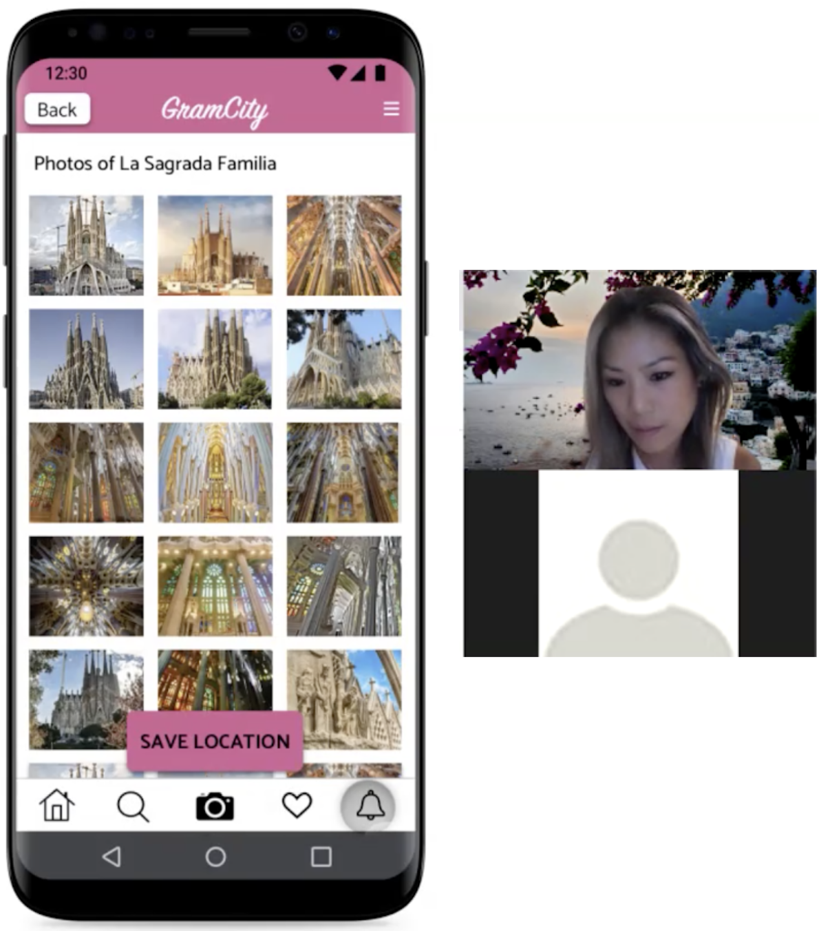
Upon clicking on a hotspot of interest, the user would be able to see all pictures uploaded by other users for that location.
I sketched a “Save Location” button so that users can plan ahead for their trip and remember to visit that location. A confirmation module would pop up to let the user know of a successful add.
When the user presses the “Saved” icon in the static bottom menu, the user would see all their saved hotspots with thumbnails of pictures from that location.

Day 4: Prototype.
Using the storyboard as a guideline, I created the prototype on day 4 in Sketch, and uploaded it to InVision app and Figma in preparation for user testing on day 5.
There was no actual app to use as a guide for the UI so I created everything from scratch except for the pink and white logo.
I followed Material.io guidelines for usability, readability and design.

Usability Test Users & Tasks.
5 users were recruited on day 1 for the usability test. The users were recruited via personal and networked connections, and in the UX Slack community.
The users testing the prototype were given a brief background to the GramCity app and a task to complete during the sessions.
They were informed that CityGram is an app to help users edit pictures to upload onto social media, and that I was tasked to design a feature in the app that would help users to find great locations to take pictures.
The task was:
Assume you already have a login and that you have decided you want to see what locations there are in Barcelona. You want to make note of this place so you remember to visit there.
Usability Test Results - User 1: Karen.
Karen found the app ‘very easy’ to understand and navigate
She went through all the bottom static navigation menu items and correctly identified each of their uses and purposes
Karen liked the text box for entering her destination on the explore screen
The categories to select interests were well liked
The map view with numbered pin drops corresponding to the list was appreciated
Without any guidance, Karen saved the location to her saved places
Overall, the test went extremely smoothly and Karen had no trouble navigating or interpreting the functions of the app


User 2: Herina.
Herina navigated through the app easily, and commented that everything was easy to understand
In the explore screen, she suggested that an option to simply explore nearby would be good
On the map and results screen, she liked that the map had pins showing, which corresponded to the listed location and its information below it
Herina suggested that different symbols or pins be used for saved places vs restaurants and other types of places
She also suggested that it would be good to link the app to Instagram, to see more pictures from there
User 3: Trisha.
Trisha thought the flow of screens and buttons made sense to her
She became focused on the content of the screen such as categorization options
The camera icon on the bottom navigation menu was assumed to link to pictures taken, instead of opening the camera
The home, search, saved places and notification icons were all correctly identified
When asked about the icon next to the ‘My Saved Hotspots’ in the saved places screen, she correctly guessed that the icon would lead to the map showing all the saved places
Overall, Trisha navigated smoothly and easily through the app, successfully completing the task


User 4: Wanhsi.
Wanhsi easily navigated to the map view of locations and liked that there was a map with a list as he considers himself a visual person
He liked being able to see all the thumbnail photos of the location chosen
The interface seemed to flow with his natural behavior, as he mentioned that he would have scrolled the different locations, explored the map, and clicked through the photos of interesting places. His language and behavior showed he knew what to expect and the app’s flow matched his expectations
Wanhsi naturally saved the hotspot and went on to check them in the saved list
However, he thought the CTA ‘Save Location’ button was too big and intrusive, suggesting perhaps a heart icon to save the location rather than a large button
He missed the map icon next to the ‘My Saved Hotspots’ title on the saved spots screen, but once he realized it was there, he liked the idea
Wanhsi made a suggestion that the results be a combination of map and list in a unified view format
Wanshi thought the bottom navigation menu items were obvious so it was ok to not have labels
User 5: Yurika.
Yurika found the navigation easy and smooth, going directly into the main CTA button to explore
She liked the map with the pins to be able to see distances between locations
Yurika thought the category tags on the map view were convenient but might become too much if you happened to select a lot of categories
The bottom menu items were correctly identified and used
She didn’t notice the map icon on the saved hotspots screen but liked the idea of it
Summary Of Findings From User Testing.
All the users were able to successfully and easily navigate and complete the task given to them.
The navigational flow, menus, buttons, icons, and information representations felt intuitive to the users.
There are a couple of UI elements that could be modified for ease of use but functionally, nothing stood out as a problem.
Suggested Improvements For The Next User Test.
In the explore screen, maybe default the starting location to be where the user is currently
Let there be a variety of type of pins to be used when saving places, up to the user to categorize
Change the floating ‘Save Location’ button to perhaps a smaller icon button to be less intrusive
No user noticed the small map icon next to the “My Saved Hotspots” heading in the saved spots screen. Perhaps make this icon more prominent, or default to a smaller map view with list underneath, or have a toggle to switch from map to list view
Summary & Key Takeaways.
By the final round of user testing, all users were able to perform the 3 red route tasks easily without any issues. The feedback throughout each stage of testing was essential to building each modification.
Being able to interview users prior to developing a concept for the app was absolutely integral to building a prototype that users valued. I had to pivot my original hypothesis after discovering what users actually felt pains about. It also helped to direct the project towards the most optimal outcome from the beginning without wasting time and effort going in the wrong direction- which would have been to attempt to solve a less significant problem for a small number of users.
While a lot of the users expressed their likes for certain features and elements in the prototype, many of them wanted to feel helpful and offer suggestions to add to the app, rather than focusing on the feedback required for what was in front of them. This became more apparent as the screens’ fidelity became higher.
A lot of users became very focused on the UI elements rather than the flow and functionality of the prototype. This had been reversed when it was a hand drawn sketch being used in the usability test.
Lastly, the owner expressed that she would have liked more versions of the UI in different color combinations after I delivered the final UI. Had I more time and if this desire had been expressed early on, I would have tried to accommodate for this. I learnt that it is absolutely crucial to have expectations set early on.
Next Steps.
There were many user suggestions for add ons which were not important enough to make the MVP cut. These could be considered for future versions of the app.
If this project was to move forward, I would need to talk to the management to see what they like / dislike and adjust accordingly.
I’d also talk to developers to get their feedback and opinion on the development side for feasibility.
