Design and User Testing for Earth Guide app-
Part 3
Click here for PART 1 of Earth Guide app (User Research and introduction to the project)
Click here for PART 2 of Earth Guide app (Information Architecture & Wireframing)

Earth Guide is a mobile app that helps users create & share travel information, itineraries, discover travel destinations and communicate with fellow travelers.
Type Of Project: Mobile application
My Role:
Design
Styleguide
Prototyping
User testing
Tools: Sketch, InVision, Milanote, Adobe Photoshop, Adobe Illustrator, Zoom
Deliverables: Moodboard, Style Guide, Hi Fidelity prototype, Usability Test plan & report, Evaluation
Client/Owner: Personal project
Moodboard.
Inspired by bursts of freshness- colors of nature, youth, energy and reminiscent of fun, simple pleasures.
The idea is to connect with a sense of excitement and adventure in the natural world, while conveying a message of ease and down to earth basics.

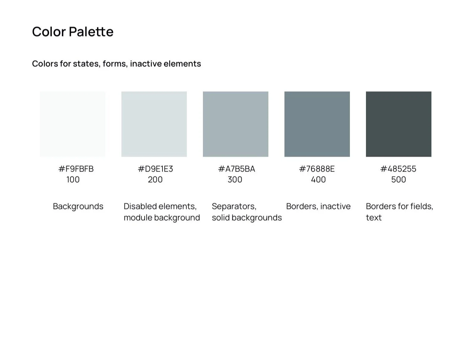
Style Guide - Colors.
I selected bold, nature inspired colors to create a sense of fun and energy into the collaborative environment. I wanted the atmosphere to be bright, inviting and feel enjoyable.
The pop of colors help to make important elements stand out, making decision making processes easier and timely for users.
I checked the WebAIM Contrast Checker to ensure that the contrasting colors passed all tests for readability and accessibility.

Style Guide - Fonts.
I chose to use the Manrope font, an open-source modern sans-serif variable font family.
I liked Manrope for its clean, modern, rounded shape and readability, as well as its diverse variable weight selection.


Accessibility Contrast Grid Matrix
Style Guide - Components.
The simple, modern style of form elements, buttons and modals help to eliminate clutter and simplify what would otherwise be a complex process.
I initially created 2 styles of buttons- CTA buttons in the primary color with rounded corners, and a secondary button in a secondary color with sharp corners for a secondary category of urgency. However, I ended up only using the main CTA button style for my prototype.


Style Guide - Form Elements.
I tried to keep form elements minimal, and used the primary color to signify both success and active items to connote a positive action. The error color was used to make any errors clear to the user, so users will always clearly know the state of the system, preventing confusion.
Labels and placeholders would always be used, to direct the user without ambiguity.


Hi Fidelity Mockup.
From the 3 red route wireflow wireframes created, I chose 2 of the more complex screens to design a hi fidelity mockup of the app.
Adding a trip, in particular the “Adding a Transport” screen, and
“Search & Discovery” screen
Following my learning of best UI practises and Material Design guidelines, I evaluated my 2 screens.

On the left are the first of two screens I mocked up. I wasn’t sure which colors would appeal to users more so I performed an A/B test on users to gather their preferences, which ended up being the screen on the right.
The top navigation menu was changed to be the primary teal color to add prominence to the task at present.
Also, the process navigation dot links at the top were changed to yellow lines instead of grey, to add more of a consistent continuous feel of flow from each task to the next.
The button text colors were changed to black for better visibility, and the bottom navigation was given colors to highlight the user’s current location.
The second screen I mocked up would be where users spend most time researching for their itinerary. I wanted to ensure the layout, look and functions felt as intuitive to the users as possible. I researched sites with recommendations (such as Yelp) to review and employ best practises for an easy to read, smooth flowing user experience.
The color scheme was changed from the left version to the right following user testing. This was to increase the visibility and contrast for important elements on the screen.

Evaluation.
I evaluated the screens based on the Material.io guidelines.
The minimal, clean aesthetic fit in with the Material Design guidelines- using a set of primary colors and accent colors, having simple understandable top and bottom navigations, and utilizing white space to simplify the aesthetic while making elements more clearly visible.
I used 5 elements on the bottom navigation, the maximum of the recommended 1-5, and I justify its case because I used small icons with labels while keeping enough white space around each item.
The examples from Material Design use a combination of patterned colorful and solid color icons throughout but I chose to stick to solid color icons only to indicate states. This was to try and keep the design not too busy.
Evaluation - Guideline Adherence.
In alignment with the guidelines, I made the text boxes and drop down boxes with a slight shadow to it instead of using a solid box around them. This was to minimize the jarring, hardness while maintaining enough contrast between the background color and the text field.
I followed the guidelines by using a simple hamburger icon and back icon at the top to help with navigating the app.
Also in observance with the guidelines, I used text labels with icons to help the user comprehend its meaning
Evaluation - Changes To Make.
Some changes or additions I decided I would like to make were to:
Add a colored highlight line and cursor to a text field that is active, to bring attention to the active box.
Add colors to buttons to indicate states for normal, pressed states on top of disabled states I already had.
Make clearer color differences for selection controls- only make them colored if they are on or selected, otherwise keep them greyed to indicate disabled state.
Ensure an indicative color highlight on the bottom static navigation for items that have been pressed or are active. Highlight the chosen menu item by adding a pop color.
To add expansion panel arrows where text can be expanded.
Consider using only partial separator lines to make a less cluttered interface.
Consider using different colored keys for itinerary items to make them easily identifiable in the calendar.
Consider using blocked colors for headers of modules to highlight them.
Make more use of shadowing to create hierarchy.
Screen Mockups - Post Evaluation.
The color palette primary colors are used consistently throughout the screens, particularly in call to action items and top navigation. This is to give a sense of uniformity and cohesiveness within different pages and functions of the app. Also, the consistent color direction means the user can comprehend the purpose of different elements faster.
Modals use a clean, simple interface with a grey partial separator to separate the heading, and a translucent grey background to help the user locate themselves in their processes.
Form field elements are aided with icons and placeholder text to help the user enter the relevant information with ease of comprehension.


Success, warning and error states pop up upon completion of tasks that users may want to receive confirmation about while using the app. These are color coded and make use of icons to clearly indicate states to the user on different levels.
The use of a colored process navigation element for involved processes such as “Add a Trip” aid the user in orienting themselves within the process, to lessen confusion and annoyance.
I used different colors of buttons to communicate a hierarchy of actions and help the user navigate.
Light partial separators divide subsections without being obtrusive and distracting while fulfilling their purpose.
I followed the layout of some Material.io apps such as Google Maps and Google Calendar to maintain the consistency and recognizability of apps and websites that users may be more familiar with. I wanted users to have a more pleasant experience where they recognize familiar components or processes and feel less cognitive overload.
Consistently colored and sized floating icon buttons are used where they are more recognizable and less likely to need an explanation. This is to make them more visible but reduce their importance in hierarchy.
Lastly, the tooltip information modals have been added in a lighter pink to be less conspicuous but visible.

Prototype.
The link to the prototype created in InVision.

Prototype.
The link to the prototype created in Figma.
Usability Test Plan.
Objective to discover and evaluate:
Initial impressions of screens and processes for red routes
Verbiage of labels, buttons and headings
Task flow logics, impressions and their understandability
Uncover any problems or confusing elements in the red routes
Whether users like the color scheme and what they think about it - what kind of emotions it conjures up
Test questions/tasks:
Can users successfully add a trip and itinerary without it being frustrating or confusing?
What do the users think of the functionality? Do they think it’s useful?
How do participants respond to the organization of the home screen and menu options?
Are users able to navigate and access what they need easily from each screen?
Do the labels and headings make sense for users?
Are the flows of screens synonymous with the intuitive flow in users’ minds? Do the processes and their order make sense for users? Do they align with the order and relevance of how they would normally plan trips?
Do the processes and each of the steps lead to a result they expected?
Testing Method: 5 users were selected for moderated remote tests using Zoom and screen share as users performed their tasks in a web browser on the Invision prototype page. Each session would last 15-30 minutes and include a short briefing, consent to video, 3 task performances and then a debriefing.
Participant characteristics:
21 - 50 years old
Travels abroad at least once a year
Uses the internet or apps to book and plan travel
Recruitment: Potential participants were recruited via community slack channels and by contacting participants who had welcomed communication during the screener survey sent out in Feb 2020.
Usability Test Plan Tasks for Users
You plan to travel to New York in August 2020 with some of your friends who have confirmed attendance. Start the process to start organizing your trip and setting up the basic details.
You have set up the basic details. Start figuring out what you’d like to do on your trip and add it to your itinerary.
You want to discuss ideas and details for your trip. Start communicating with your fellow travelers to discuss these topics.
Highlights from the 1st Round of Usability Test.
Users liked the top navigational process dots for Add a Trip flow because they could see where they were at in the process
A few users found the input types confusing in certain sections- e.g. preferring a text input instead of a search field to enter the transport name and preferring a drop down over search field in the Mode of Transport
Users liked that the itinerary would sync with everyone else’s schedules
The users generally thought the processes were pretty straight forward
Users liked the voting and polling option in the Collaborate flow and thought it was a great idea
Some wording of labels were questioned, e.g. a user wanted Accommodation to be called “Hotel” or “Staying At”, and Transport to be called “Method of Transportation” or “Transportation”
All users liked the map and suggestions of places to go
All users finished all tasks without major problems or frustration, although they were sometimes confused
Changes to implement:
Change “Add a Transport” input fields from search to text input and drop down fields.
Change “Tap to Select” to “Select Date on Calendar” (better accessibility and more direct wording)
Change “Add a Trip” header title on the summary page to reflect that it is a summary page
Review the words of the button “Save, sync and create itinerary” to make it shorter
Change the color of the highlight in drop downs of forms from primary to secondary color to avoid confusion
In Select Trip & Contacts dropdown in Collaborate, make drop down more prominent and put a placeholder or label to describe “Select Trip from Dropdown to Add People from the Trip”
Usability Test Report.
The usability test was conducted remotely using Zoom video chats that were consensually recorded. The screen share option allowed me to see where the users’ mouse pointer movements while seeing the users’ facial expressions.
The goals for the test were to determine whether the users were able to successfully complete red route tasks, and whether the layout, sequence, verbiage, colors and labeling easily made sense for users. The hope was to discover that generally, users had no trouble in achieving their goals and were not confused, misinterpreting or annoyed by certain UI elements or processes.
I had initially hypothesized that the verbiage and words I had chosen to use must be the most intuitive to most users but I wanted to verify this. In total, 4 users were recruited. 2 were found from the community on Slack, and 2 others were initial participants who had filled in the screener tests and had consented to further communication.
Test Findings.
An Affinity Map was created to categorize observations, issues and ideas for improvement.

Affinity Map post-its
Issues were assigned a severity scale:
CRITICAL (4): Multiple users could not complete a task. These issues must be fixed before the launch of the app
MAJOR (3): Multiple users struggled to complete a task. These issues are important to fix before the app is launched
MINOR (2): Users completed a task but raised concerns about design choices. These should be fixed when time allows it
NORMAL (1): Users identified a cosmetic problem. These should be fixed when time allows it
NOT A PROBLEM (0): I don’t agree that this is a usability problem at all
Test Issue #1.
Severity: 3
Some users had a little difficulty accessing certain functions because their accessibility was not obvious to them.
Summary:
The highlighted color of a selected checkbox field confused user 3 into thinking it was a header as it coincided with the header color and CTA button colors.
User 1 thought the icon for Collaboration was not clear and suggested that the color of the circle be different from the 3 figures:

User 1 did not understand the Android share icon as he is an iPhone user. He wanted a more universal icon for “Share”.
User 2 thought the dropdown arrow on form field dropdowns were too hard to see and wished it to be more prominent or easy to understand that it was a dropdown.
Recommendations:
Change the highlighted color of a selected checkbox field to a secondary color.
See if other users have the same problem identifying the Collaboration icon. Consider changing the icon for Collaboration circle to be grey.
For an iOS version of the app, the appropriate Share icon would show so I would not change this aspect.
Label better descriptions for form field dropdowns to make it easy to understand that it is a drop down. E.g. “Select trip from dropdown to add people from the trip”
Test Issue #2.
Severity: 2
Some of the form fields functions did not match the user’s idea of what kind of input they would like to have entered.
Summary:
The Search icon to add a Transport field in Add A Transport page of the Add A Trip flow was confusing to the user as she thought that meant you can search and book a transportation option. She expressed that she thought a text field would make more sense.
The Search icon for Mode of Transport was also confusing to her and she preferred a dropdown icon instead.
Recommendations:
In Add A Transport, Change the form field to a text field without the search icon.
Change Mode of Transport icon to dropdown instead of Search icon.

Before (left) vs after (right)
Test Issue #3.
Severity: 2
Some of the choice of words for headings, titles and labels did not make sense to a user.
Summary:
User 1 thought the word Accommodation was not appropriate in his views and said he preferred “Staying At” or “Hotel”
User 1 thought “Transport” should be called “Method of Transport” or “Transportation”
User 1 did not like transport “for ___ to ___” and preferred “from ___ to ___”
User 2 felt that on the itinerary calendar, the tooltip “Tap to Select” was not quite clear enough. I suggested “Select Date on Calendar” and she liked that much better for easier understanding.
User 1 thought the top header title for the Summary page in Add a Trip flow should not be called Add A Trip, but reflect the summary more.
User 1 felt the button label “Save, Sync & Create Itinerary” was too long and that it should be more succinct.
Recommendations:
Change Accommodation to “Staying At” or “Hotel”- make both versions as an A/B test and ask users in the next user testing which they prefer.
Try an A/B test and ask users whether they prefer “Transport” or “Transportation”, which is shorter and more to the point than “Method of Transport”.
Change transport labeling from “for ___ to ___” to “from ___ to ___”
On the itinerary calendar, change the tooltip “Tap to Select” to “Select Date on Calendar”.
Change the top header title for the Summary page in Add a Trip flow to “Review Summary”
Change button name from “Save, Sync & Create Itinerary” to “Sync and Create” and then ask users in the next round of user testing what they think it would do, to make sure it encapsulates their expectations.
Usability Issues By Priority.
Major Issues.

Minor Issues.


Changes Following User Testing.

I initially had 5 quick links for users on the landing page but then decided against it as the most important tasks were “Add a trip” and “Discover” based on my red routes. They were also easily accessible via links on the bottom navigation.
I replaced the 3 buttons with an “Upcoming Trips and Alerts” box. I felt it was critical users have updates on what is next on the agenda if they are going to utilize this app frequently and depend on it.
Following user testing and expression about confusion as to what users would search for in “Mode of Transport”, I changed this to be a dropdown selection instead.
I also changed the Transport field from a search field to a text field.
Lastly, I changed the labeling “Transport for …” to “Transport from …”.


I performed an A/B test on these screens to find out what users preferred.
I wanted to test what form highlight color was understood best, as during the 1st prototype test, a user had expressed that he didn’t realize the highlight was a form, as it was the same color as the top navigation bar.
Results showed that ⅘ users preferred the pink highlighted color. If this was to be changed, it should be reflected consistently so that all highlighted elements in the app are the same pink color.
Highlights from the 2nd Round of Usability Test.
After some modifications to the prototypes based on the first round of user testing, I performed second round with 5 participants. These are some highlights from the test:
All users went correctly to Add A Trip CTA button immediately from the landing page for task 1
There was a suggestion to put Transport before Accommodation in the process as that is the mental model thought process when booking trips
Users went through the Add to Itinerary process quickly and easily without any wrong clicks or misdirections
Most users went through task 2 to add an itinerary item easily and quickly
All users went through task 3 to collaborate easily and quickly
For the A/B test, 4/5 users preferred pink vs the teal highlight for checked form items
For the A/B test, 3/5 users preferred Accommodation vs Staying at
For the A/B test, all users preferred Transport vs Transportation
For the A/B test, 4/5 users preferred “Sync and create” instead of “Save, sync and create”, and liked the summary page
Summary & Key Takeaways.
By the final round of user testing, all users were able to perform the 3 red route tasks easily without any issues. The feedback throughout each stage of testing was essential to building each modification.
Being able to interview users prior to developing a concept for the app was absolutely integral to building a prototype that users valued. I had to pivot my original hypothesis after discovering what users actually felt pains about. It also helped to direct the project towards the most optimal outcome from the beginning without wasting time and effort going in the wrong direction- which would have been to attempt to solve a less significant problem for a small number of users.
While a lot of the users expressed their likes for certain features and elements in the prototype, many of them wanted to feel helpful and offer suggestions to add to the app, rather than focusing on the feedback required for what was in front of them. This became more apparent as the screens’ fidelity became higher.
A lot of users became very focused on the UI elements rather than the flow and functionality of the prototype. This had been reversed when it was a hand drawn sketch being used in the usability test.
Each round of user testing revealed new insights and potential improvements. It was definitely beneficial to have multiple user testings at each stage of the development. The faster the lessons were learned, the less severe the changes required became.
The most insightful and surprising user testing results came from the first round of user testing using hand sketched screens. Being the first time to ever test my concept, it offered both validations and unexpected insights from which to make improvements for the next round of tests.
After the first round of user testing, the problems identified and subsequent modifications became continually smaller in magnitude and significance.
Being able to talk directly to users and gain an understanding of their thoughts and reasoning was immensely beneficial to building a prototype where users easily navigated, valued and understood the features.
Although highly unlikely to happen in the real world, being in charge of every step of the project from research, informational architecture to design and testing helped me gain a deep understanding of the project’s scope, its users, and the problem at hand.
Lessons Learned.
The importance of screening test participants when the app or website assumes a particular level of knowledge or experience in the domain.
You can never assume what users truly feel and think. Hypotheses need to be validated through interviews, user testing and other appropriate methods.
Rapid prototyping and testing on users is the fastest, most effective way to test hypotheses and prove whether efforts are being directed in the best way to solving a problem.
Moderated tests are highly effective especially as you can engage the user and investigate deeper into interesting insights. Being able to see facial expressions, comments and nuances were helpful in understanding the user.
There is a point at which more users being tested, or more testing being done does not add as much dramatic change or level of improvement. Testing 5 users each time was a good, adequate number to develop user patterns and understanding without being overwhelming.
Next Steps.
There were many user suggestions for add ons which were not important enough to make the MVP cut. These could be considered for future versions of the app.
If this project was to move forward, I would need to collaborate with developers and engineers to get their feedback and opinion on the development side. A handoff to the development team would be completed, possibly using a tool like Zeplin to export and publish finalized designs from Figma, Sketch, Adobe XD and Photoshop. A continuous check-in for designer-developer discussions should recur repeatedly throughout the design phase, with careful thought for version control, comments and asset management.
I would also collaborate with the business and product manager to ensure that the business goals were being met.