Information Architecture for Earth Guide App-
Part 2
Click here for PART 1 of Earth Guide app (User Research and Introduction to the project)
Click here for PART 3 of Earth Guide app (Design, Prototyping, User testing)
Earth Guide is a mobile app that helps users create & share travel information, itineraries, discover travel destinations and communicate with fellow travelers.
Type Of Project: Mobile application
My Role:
Information architecture
User journeys / user stories
Use cases
User flows
Sitemap
Sketches & ideation
Wireframes
Wireflows
Tools: Sketch, Miro, InVision, Adobe Photoshop, Adobe Illustrator, Zoom
Deliverables: MVP, Use Cases, User Flows for Red Routes, Sitemap, Sketches, User Testing, Wireframes, Wireflows
Client/Owner: Personal project
MVP Definition.
After establishing a solid understanding of who my users would be and what they needed to achieve, I did a 1 hour ideation brainstorming session with paper and pencil. This was to let all the ideas that were subconsciously or consciously in my head, as well as unexpected ideas, to be expressed.
Afterwards, I wrote on each post-it a step in each user story (pictured below). Having all the things users may want to see and do in the solution broken down, I then rearranged them into logical categories to be prioritized. I rated each user story depending on how crucial it would be to resolving the user’s pain point, and came up with the MVP definition to validate my hypothesis about the problem and solution:
An application that will allow users to discover and share places of interest, build and edit their travel itinerary, connect with their contacts and collaborate on shared trips.

Ideation Sketches.

How to Represent Information?
I tried to think of different ways to represent information of value to users, from various sources.
Users had expressed during interviews that they liked using maps and were comfortable with using calendars to organize their itinerary. They had also expressed that spreadsheets were not as easy to view.
I wanted to keep this system of using maps and calendars but to try and make it more representative of the user’s trip.

Simplifying.
During interviews, users had mentioned that discussing group trips was difficult to facilitate. I wanted to explore different ways to facilitate users communicating and coming into agreement about trip related decisions.
I also wanted to ideate how to display information for users to help them make easier, more informed and faster decisions on their itinerary in a more intuitive way.

Creating Value.
On this page, I was brainstorming different ways to represent information from different sources that are meaningful yet easy to understand. From user comments, the best way seemed to be using a combination of maps and ratings. Because different people appeared to value varying sources of information to others, I wanted to figure out a way to give users an option to filter their findings.
I also sketched different ways of facilitating communication and letting users participate in the group decision making process. Allowing for collaboration while empowering users to still be an individual was an important factor in my ideal solution.

Collaboration & Meaningfulness.
I explored ideas to make this design a total, complete solution for communications between group travelers. This included sharing files such as pictures, videos and other files through the app.
Collaborative ideas were sketched e.g. allowing multiple users to edit a single itinerary, and adding voting of ideas for diplomacy and transparency.
I brainstormed different ways to represent the itinerary in a meaningful and easy-to-view way. This involved thinking about how to express a timeline with information in a map format.
MVP Definition.
An application that will allow users to discover and share places of interest, build and edit their travel itineraries, connect with their contacts and collaborate on shared trips.

User Stories
From the user stories, I determined 3 main red routes that I would focus on for prototype development (in green, pink and yellow above). These user stories were crucial to defining the functional needs of my solution without getting into the details of design.
Use Case Scenario.
An example of a user using the EarthGuide app would be when they decide they need to start preparing for a group trip.
They would add a trip to the app by entering all details for destinations, dates, accommodations, transports and people involved.
They would then create an itinerary open for collaboration by the participants, and add to the itinerary either manually, or by searching for recommendations then adding them into the schedule.
Collaborations would be facilitated via chat rooms with trip participants, with preference voting also an option for group activities.
All itineraries and calendars would be synced between all trip participants.
User Flows for Red Routes.
I identified 3 red routes as the main user task based routes that I would focus on for my MVP. These were chosen based on what users had expressed during the primary research as being of value or a necessary process in their trip planning. Those routes were:
Create a trip and itinerary
Find places to go
Collaborate with people on the trip
For these main routes my personas would need to complete, I created a user flow map for each in Sketch.
I started by referring to my user interview notes about what data and decision points were important in their travel planning, then added them to the user flows. In addition, I test drove competing travel websites and apps to add common data entries and functionalities that seemed crucial to the user.
User Flow Red Route Key


Red Route 1: Create A Trip and Itinerary

User Flow for Red Route 1
The “Find places to go” process is embedded in the “Add a trip and itinerary” route, and I wanted to keep them separate. I found in my user interviews that often, users would browse for places they might want to visit and then search in that area, rather than knowing from the beginning where they wanted to visit. Hence, I felt they were two independent entities with no certainty which would come first. I wanted to give users this flexibility and freedom.
In “Find places to go”, I wanted to give users of differing travel experience to be able to easily search for places. This led me to decide to allow the ability to search from the landing page, the map, and also from the itinerary- using a variety of input data types.
Red Route 2: Find Places To Go

User Flow for Red Route 2
During user interviews, 3 of 5 interviewees mentioned they had specific tastes so they would take different types of recommendations from different people depending on what types of activities they were. Hence, I decided the search filters are a critical factor in users adopting the recommendation feature. I also researched different travel and restaurant discovery sites to see what filters they enabled for their customers. I would have added more filters but for the MVP, I felt this was enough.
I came to understand while talking to users that during their searches, they would often use Google maps to ‘favorite’ a place for later even if they were not committed to going there on a trip. With this in mind, I wanted to let users ‘favorite’ places that they could keep a list of, in case they wanted to add it to their itinerary later.
Red Route 3: Collaborate With People On The Trip

User Flow for Red Route 3
For the last red route “Collaborate with people on the trip” I followed procedures on commonly used group messaging apps. The most common app amongst interviewees by far was Whatsapp. I imagined the user flow to create and start a chat conversation to be similar, with added variables being related trip and dates.
Sitemap.

During my primary research, I found that more and more users were tending to research and plan their trips on their mobiles. With this in mind, I decided to focus on a mobile app solution. I followed material.io guidelines to keep the static primary navigation to 5 or under, all being of equal importance and related. I brainstormed all the distinct screens or functionalities that would be required to perform the 3 red routes. I then placed them into related groups and named them labels that were easy to understand. The main categories were named to be familiar with commonly used apps and sitemap labels.
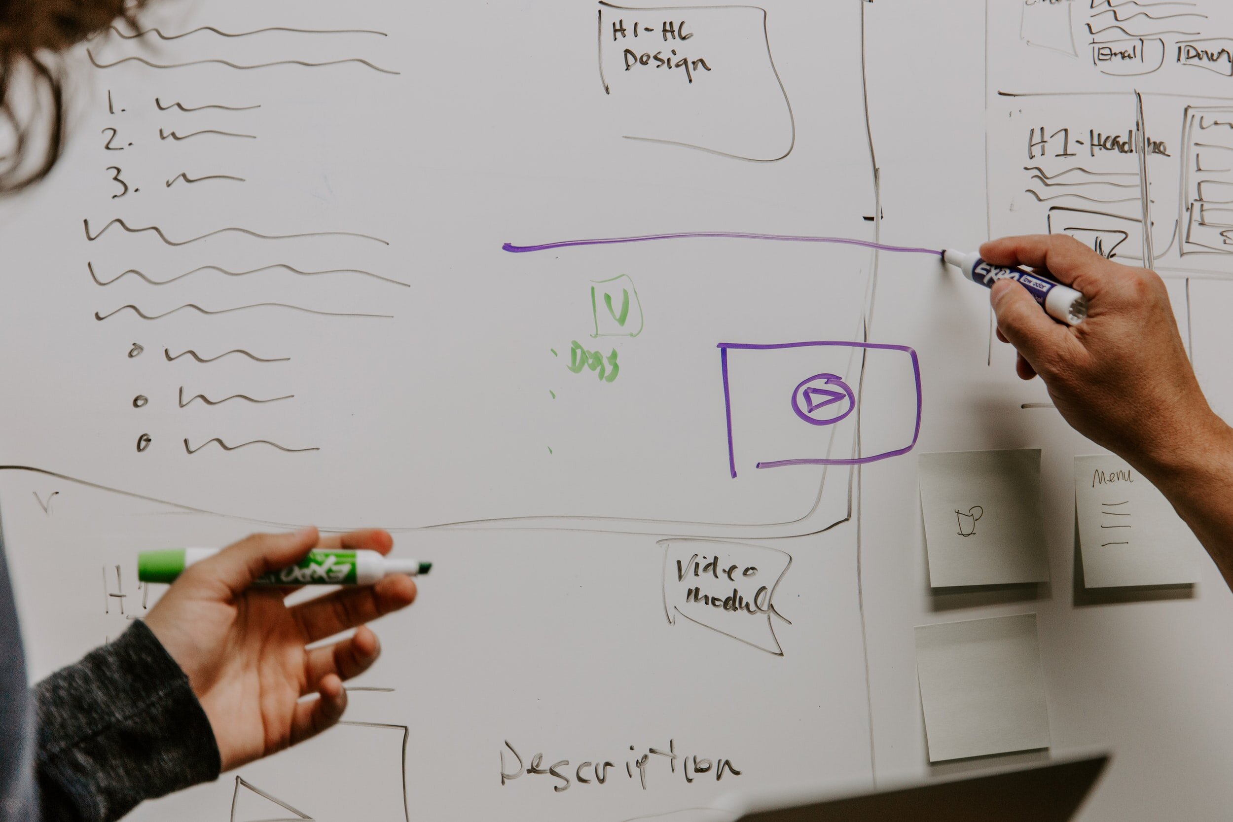
Lo Fidelity Sketches Of Red Routes.
Using paper and pencil, I sketched out how I imagined the red route user stories would play out on an app, being careful to make each step clear and purposeful. I used post-its for modals, and a purple highlighter for selected buttons.
The point was to be focused on the functionalities rather than layouts and visuals.
Progress Bar.
Most tasks did not require too many screens but with “Adding a trip”, because it required 5 screens/steps to finish the task, I added a progress bar at the top to keep users informed of their progression.
Back Navigation.
Even with the Android ‘back’ button being a hardware feature of the phones, I decided to add an additional ‘back’ button for complete user control and freedom.
CTA Buttons.
I wanted to give users easy access to what I assumed would be commonly pressed buttons, so in addition to them being available via the primary navigation buttons, I put them as big CTA buttons on the landing page of the app.
Tooltips.
I added tooltip modals to give users a sense of what actions to take, and what would be possible even with the limited functionality of sketched screens.
Lo Fidelity Sketches - RED ROUTE 1: Add A Trip


Lo Fidelity Sketches - RED ROUTE 2: Find Places To Go


Lo Fidelity Sketches - RED ROUTE 3: Chat & Collaborate


Guerilla Usability Testing.
To do a quick initial test for feedback on the sketched designs, I planned a guerilla usability test. The goal was to find out if I was on the right track in designing the solution to my problem space. I needed to find out what users liked, and what felt less intuitive to them so I could improve it. I also wanted to see how well the participants performed given tasks, if any labeling or navigation didn't make sense, what they expected to see or be able to do, and what their thought processes were as they navigated the app.
Due to social distancing regulations with the COVID-19 pandemic, all public areas had been closed indefinitely, making it impossible to perform guerilla testing in public. I recruited some friends and networks of friends to perform the test over a Zoom video chat using the Marvel App to make my sketches interactive. The participants were from the USA and Australia, and they were briefed on the purpose and process of the test. The participants were 29 - 44 yrs old and all well traveled.


The 3 tasks given to users were:
You want to start planning a vacation and you know you want to travel to Barcelona on Jan 1st 2021 with 2 of your close friends. Can you start the process of beginning your planning?
You don’t know too much about what exactly to do in New York but want to add things to your agenda. Begin this process.
You want to be able to start communicating with your 2 friends in regards to the trip. Begin the communication.
The goal was to have users successfully achieve their tasks with minimum confusion and frustration, and to find out what could help them in the process.
Test Findings.
A common user assumption I discovered was that when it came to adding accommodation or flights to the trip details, the users wanted to be able to search for accommodation and flights to book it as well.
To start planning a trip with known details, most of the participants went straight to DISCOVER to begin their itinerary rather than ADD A TRIP or TRIPS. This was despite both options being clear CTA buttons on the landing page and users being told exactly where they are going.
Everyone was comfortable with having the map as the discovery part of finding places. They expressed relief in seeing the filters and sorts in searches that they considered important.
I didn’t expect people to want to book flights and accommodation directly from the app but it made sense as people want one interface to help them achieve all their goals. Perhaps my description to the users of the app’s functionality should have been clearer- that it is not a booking system.
I was able to make revision notes about navigational issues from the way the participants interacted and moved (or wanted to move) through the app. Users’ logical process flows were evident when they didn’t see the screen they expected- but it usually wasn’t consistent nor highly problematic.
Once the participants understood the purpose of the app- that it was more for discovery and organizing than booking accommodation and flights, they became more confident and relaxed.
The collaborative and organizational aspects particularly made users believe in the value of the app. Users found the app to be helpful and they valued the recommendations and filter/sort options greatly. They also loved the ability to communicate with friends on the app and have everything organized in one place.
Recommendations.
I would make some minor improvements to the navigational processes which are not part of the MVP. In particular, when one mini task is completed, where users are directed to upon pressing “BACK” or “SAVE”. These would be based on what they had expected to see upon clicking certain buttons. Some users expected to go back to search results, or back to their itinerary.
I would look into how complex it might be to allow booking accommodation and transport directly from the app for the later versions of the app, also not part of the MVP.
I would create suggested itineraries that are already made that people can personalize for themselves, based on the recommendations from their contacts and reviews online.
Based on the order of buttons users clicked and screens they expected to see, I decided to make changes to the options available to users to follow their natural processes. Allowing users to go to DISCOVER first, find things they like, then favorite things and add to the itinerary.
I decided to add times and categories for transport details, because the users seemed confused what and how they would enter details.
I decided to add a summary page upon entering the trip details in ADD A TRIP and allow users to COMMIT and SYNC with their contacts and calendars. This is to let users see the result of the steps they had undertaken thus far. Because there were 5 steps of users entering details, it would serve as a helpful reminder to users what they had entered before committing and creating a trip from the entries.
Another change I implemented was to simplify the hourly itinerary blocks to a simpler view but allow for granularity when needed. One user mentioned that the hourly blocks were too overwhelming. I researched some mobile calendar apps and decided it may be better to only show what was scheduled, without it being equally segmented into hourly daily slots.
I decided to add the collaborate/chat function from the trip management page. This is after seeing a few users try to go to the MANAGE TRIPS page to perform task 3, which was to collaborate and communicate with people on the trip.
I also decided to add the option to invite contacts to the app from the chat, based on user comments.
Wireframes.
Incorporating interaction design principles, I turned my initial design sketches into digital artifacts using Sketch. Taking note of insights and observations made during the previous guerilla user testing, I made sure to integrate my learnings with the principles into these mockups.
By creating a low fidelity digital version of the app, I was able to identify critical design decisions that I would need to make. It was important to be able to do this while having the flexibility of not having a labor intensive design yet.

Interaction Design Principles.

Consistency, standards, heuristics: to prevent user error and make an application easy to learn. e.g. by using similar elements to achieve similar tasks, and having similar functions and behaviors throughout. I used the same ‘add’, ‘favorite’ and ‘share’ icons throughout the app to let users familiarize themselves with actionable items. I also tried to follow layouts of popular apps like Google calendar and Google maps.
Visual hierarchy and emphasis: by arrangement of elements in a way that implies importance. Because this would influence the order in which the user perceives what they see. Order was created by visual contrast between objects in a field of perception. Visual contrast was achieved by size, proximity, color, opacity, and actual tonal contrast between elements. e.g. 40% opacity dark grey layers behind module pop ups, use of different levels of boldness and sizes in fonts, colors and sizes of buttons.
Recognition rather than recall: by showing users things they can recognize to improve usability over needing to recall items from scratch. e.g. I used common standard icons, and where there were no standards, I tried to make them as intuitive as possible, with labeling.
The interaction design principles focus on the interactions users have with the product and how to make those interactions as streamlined as possible. My goal was to create an effective interaction design so users can understand what the product is used for and how to use it just by looking at it.
Discoverability: so users can find what they need and are clear about what actions it performs, e.g. I labeled any non standard / non universal icons, used universally worded labels on buttons, and same colors for related items.
Signifiers: to indicate an available interaction, e.g. I used tool tips to signify how to use certain parts of the app.
Feedback: to show information about the impact of an action and ensure visibility of the system’s status, e.g. confirmation modules were used to show successful edits, adds, saves, etc.
Conceptual and mental models: to match images in a user’s mind about their expectation of a certain interaction and how something works in the real world. I wanted to make the interface easy to understand and use so it was intuitive. I changed the flow of the screens to match the sequences of what users tend to do in their travel planning.

Wireframes.
Below are a few screenshots of the wireframes I created.


Wireflows.
Using the 3 red routes identified earlier, I created wireflows for each. This combination of wireframes and user flows visually depicts the user’s journey as they work their way through each screen of the app.
The wireflows are particularly useful for showing multiple states of the same screen (e.g. modules), and more complex interaction states.
Red route 1 = Add a Trip
Red route 2 = Find Places to Go
Red route 3 = Chat & Collaborate
Adding A Trip & Creating An Itinerary Flow

The entire flow for Create A Trip & Itinerary
Search & Discovery Flow

The entire flow for Find Places To Go
Collaborating & Starting A Conversation Flow

The entire flow for Collaborate & Start A Conversation