User Research for Earth Guide App- Part 1
Click here for PART 2 of Earth Guide app (Information Architecture & Wireframing)
Click here for PART 3 of Earth Guide app (Design, Prototyping, User testing)
Earth Guide is a mobile app that helps users create & share travel information, itineraries, discover travel destinations and communicate with fellow travelers.
Type Of Project: Mobile application
My Role: Concept discovery, user research, secondary research, creating personas & empathy maps
Tools: Adobe Photoshop, Adobe Illustrator, Zoom, Google Forms
Deliverables: Primary and secondary research, competitive analysis, user research screener survey, user interviews, affinity map, ‘how might we’ statements, empathy maps, personas
Client/Owner: Personal project

The Problem Space
When people travel individually or in groups, the workload to research and plan where to go is very high. It is also difficult to share tailored information in a structured, communicative and complete way.
The EarthGuide resolves this problem by offering a social platform that travelers can use to communicate, collaborate, receive and share trusted recommendations with people in their network.
The initial hypothesis was that there was a desire for a way to be able to create, organize, edit, share and view itineraries in a way that is easier and more connected.

Challenges & Barriers
There were a couple of challenges and barriers I faced in my idea for a solution to this problem space.
1: Due to the global Covid-19 pandemic, there was a barrier where users could not envision themselves being in mental state of mind to travel.
2: Most users had many years’ experience trying to perfect their travel planning process using laborious tools like spreadsheets or documents. They had used these tools for so long that they felt comfortable with them even though they were basic and admittedly not the ideal way to plan.
3: Through my research and interviews I came to realize a lot of people wanted a one stop shop to combine and integrate all their travel booking and planning systems. This could involve as many as 5-10 apps or websites, which was beyond the scope of my project.
Potential payoffs
Revolutionize.
The potential payoff to solving the identified problem would have significant impact in revolutionizing the way people communicate in regards to travel.
Integrate.
It would not only facilitate sharing of information, but also integrate the functions of a number of systems that people require to plan their travels.
Simplify.
The greatest benefit lies in the fact that there is no single website or app that handles these functions. It would significantly reduce the number of touchpoints with multiple sites and apps, helping to achieve simplicity and efficiency.

Methodologies
I created a research plan with the methodologies I felt were most suited to research the problem space. They were chosen to help identify potential users, understand their characteristics, their pain points with current systems, needs and opportunities for solutions in the growing travel industry.
From my initial questions, the topic of multimedia files turned out to be of less importance following my user interviews. Several of my interviewees mentioned the pains of discussion and agreement during group trips, which made me pivot to focus more on the collaborative aspect of communicating with fellow travelers.

Research questions.
These questions were brainstormed to explore my initial direction and concept that I wanted to test and prove. Initially, they were from a culmination of ideas from hearing friends discuss their travel experiences and frustrations.
How much do people rely on their networks to receive tips and suggestions for planning their travels?
How do people share information about travel suggestions and tips with their peers and networks?
How do people share multimedia files with people they have traveled with during and after their trip?
Which apps do people use to plan their trips and how easy or time/effort consuming is it to achieve their goal?
What are their current pain points?
Secondary research and competitive analysis.
I decided to conduct these in order to see if any other apps were already doing similar things. If there weren’t, I would find where opportunities exist. If there were, why were they not being adopted more?
Primary user research survey.
This was to assess suitable interview candidates and capture both quantitative statistics and qualitative information from a broader audience (49 users). I wanted to see what general patterns there were amongst all levels of travelers, then to focus on more frequent travelers for a targeted interview.
Diary entry.
I decided a diary entry of candidates who were planning to travel soon would be beneficial, to review the natural progression of the thought processes of a confident, experienced traveler (1 user- but never completed due to Covid-19 travel complications).
Focus group interview.
A focus group of well traveled users was facilitated to create a casual setting where users could freely contribute their thoughts, processes and pain points (3 users). This enabled a free flow of discussions about user problems and frustrations that did not come from my assumptions or observations, but direct from the source.
Structured user interview.
The interviews were crucial in order to assess qualitative information and in depth insights from a genuine user perspective in regards to travel planning and execution. A set of 33 questions were pre written and selectively asked according to user answers during the interview, to gain an in depth perspective into the users’ minds (5 users).
Usability testing with low fidelity hand sketches.
I performed a usability test with lo fi sketches, to create a fast and effective way of gaining feedback on the validity of the app’s direction (5 users). It was an important step before I invested more time and effort into the specific visual details of the app, and also allowed users to focus more on the interactive aspects of travel planning.
Usability testing with wireframes.
The test with wireframes was in order to test the changes made following the lo-fi user test and address major concerns before getting into the details of the UI, to minimize wasting time (5 users). The tasks given to users were to test whether users could execute the 3 main red route tasks in planning and facilitating travel planning.
Iterative usability testing with hi fidelity prototypes.
I tested 5 users over 2 sessions with iterative improvements and changes made. Making incremental changes from verified user test results, and as the fidelity increased, was an effective way of testing the idea and concept while maintaining momentum for product prototype delivery.
My roles in this project.
I was the lead and solo designer in this project. This meant that I was in charge of the following.
Discovery
User research
Personas & empathy maps
Information architecture
User journeys / user stories
Use cases
User flows
Sitemap
Sketches & ideation
Wireframes
Wireflows
Evaluation
Design
Styleguide
Prototyping
User testing

The solution:
My approach to solving the problem was to use a design sprint approach to get a strong starting point and direction, then proceeding onto phases of prototyping using an iterative, evaluation heavy, human centered design approach to minimize risk and progressing too far away from focusing on the user needs.
Secondary Research.
Since the travel industry is so universal, widespread and growing at such a fast pace, it was crucial to have an understanding of the market and what was out there. It was expected that there would clearly already be a lot of research done about the travel industry. My goal was to seek information about the process of planning.
Upon research of popular travel apps, websites, articles, blogs and consumer insights, it was evident that there was no single app or process that helped users successfully and efficiently plan a trip.
Most people resort to Google to find information but they must then research, filter and reorganize. Apps that currently exist only resolve one of the many separate components of planning and executing a trip. There are apps that do their job really well, but you still need other additional apps to organize each other aspect of planning.
Suggestions from a user’s network, itineraries, maps, tips and media are not currently readily available on any single platform. Most people resort to search engine results, Google Maps, travel guides, or blogs to find their information. The value of being able to share already researched information does not seem to have been exploited yet, even though people value their peers’ opinions.

ThinkWithGoogle research.
A research by ThinkWithGoogle took a snapshot of a real traveler's process in planning a trip over 3 months. Results showed that 24% of the digital touchpoints occured on the mobile phone, and 43% of the time was spent on web searches, finding restaurants, events and activities to do.
A user’s time spent managing travel research. Source: ThinkWithGoogle

Competitor analysis.
I wanted to learn what other solutions there were out there in the competitive landscape, and if there were, why they could possibly not have been adopted by travel planners. So I decided to do a competitive analysis to compare the apps functionality and heuristics.
I decided to do a heuristics analysis on 3 of Nielsen Norman’s Heuristics for Usability Design, to have a recognized industry standard to compare the competitors against.. I selected 3 top competitors in the travel industry (of which 2 are shown here) to compare and analyze. Some of the competitors consistently topping the lists for best travel apps or websites (according to Expedia, Forbes, and The Points Guy) were:
Guides by Lonely Planet.
For offline maps; city guides for where to eat, what to see, and attractions; currency converters; phrasebooks; public transit and local guides.
Airbnb.
Connects travelers with places available for rent, with reviews. It provides itinerary suggestions nearby and offers local experiences near your booking destination.
TripAdvisor.
Offers a global platform with user-generated content, reviews, media, price comparison tools, and online reservations for transportation, lodging, travel experiences, and restaurants. It is, however, heavily influenced by paid marketing material.
Google Maps.
The primary navigation app that most travelers use during their trip. It allows you to map locations and get directions (walking, cycling, driving, public transportation, ride-hailing services). You can make restaurant reservations, save your favorite spots and read reviews. You can download specific city or area maps ahead of time for offline access.
Triposo.
A social travel site and mobile app that uses algorithms for journey planners. You can ‘favorite’ locations, read about the background of places, access weather, safety tips, details on what to see and do. Triposo also offers options for booking hotels, restaurants, tours, activities and experiences in over 50,000 destinations.
The app, available for iOS and Android, shows recommendations where to go based on information given to the app, e.g. weather, time, and other variables including those extracted from Facebook. The app works without an internet connection and you can download information before departure.

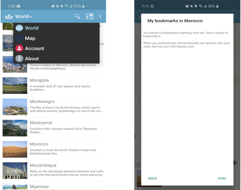
User Control and Freedom was below average. I found the interface minimal but even so, it was difficult to assume what certain symbols and labels meant. There was no easy way to exit, navigate back to search results, and the app lacked hierarchy in its menus or navigation- leaving the user confused and disoriented.

Flexibility and Efficiency of Use was lacking a great deal in Triposo, especially with what felt like insufficient information. There was no way of seeing all places of interest in the app’s map- only items that had been saved in your bookmarks. This seems to defeat the purpose of discovering places near you, especially as the places of interest are only listed with a distance value, without being shown on the map.

Aesthetic and Minimalist Design was average. Although the design is minimal, my opinion was that it was not aesthetically pleasing. The font, typography, layout, icons and content were basic. The layout was not quite intuitive, especially with the lack of hierarchy, options to exit or go backwards to the previous screen.
TripIt.
Organizes your itinerary and documents by creating a master itinerary of your upcoming travels. You can set your reservations to be sent automatically to the app, where it organizes them to be viewed even offline. The information is synced with your calendar, available on multiple devices, and is shareable with others. It shows transportation options, places near your accommodation, and stores important travel documentation. There is a free version and paid ‘Pro’ version of the app with added features such as real time flight alerts and reminders, provides country specific information, and tracks users’ reward programs. The app is available on both iOS and Android.


User Control and Freedom was fair. TripIt has a very flat structure overall and its functionality is not complicated nor multidimensional. There is a main menu along the bottom row showing the major features and upon entry of each menu option, there is always a backward navigation button to return back to the previous screen. If at any time you lose track of where you are, it is quite simple to keep navigating backwards until you reach the home menu down the bottom.

Flexibility and Efficiency of Use was fair. The need to repeatedly verify your identity every time you wanted to access your profile (where travel documents and contacts were kept) felt redundant and annoying. This happened even if you had just accessed it seconds ago.
Editing automatically filled in travel information from confirmation emails was fairly easy to do, allowing flexibility to control and correct errors.

Navigation is quite intuitive with certain shortcuts available to users who are familiar with the app. It is quite easy to find the information you need. However, sharing information is limited to email sharing only.

Aesthetic and Minimalist Design was fair. TripIt has a very simple and easy viewing interface. The features are minimal, there are lots of grey or white spaces and minimal graphics. However, it does add to fact that the app is not confusing or frustrating to use, as it appears to fulfil its role and goal well despite the simplicity.
Competitor Analysis- Summary.
User Control.
Based on the competitive analysis my conclusion is that it is important for the user to feel in control, easily navigate and have freedom to access what they want. This includes being able to undo, edit, redo and exit from a certain screen, as well as having a clear hierarchy. The user needs to have a good idea of where they are to prevent frustration and abandonment of their tasks. The competitors’ apps rated below average to fair on these levels and I felt compelled to make these a priority for my users.
Flexibility and Efficiency.
The level of flexibility and efficiency was below average to fair in the competing apps. It became apparent each user would not have the same level of experience, background or trips so being able to customize aspects of it would be crucial. The users I interviewed also mentioned flexibility being an important element of their planning. In my design, I knew it would be necessary to have flexibility in the way that users can connect to others.
Findability.
Allowing the user to find the information they seek is essential. Not being able to quickly access screens or sections, and having roadblocks causes inefficiency and creates a greater chance of the user not achieving their goal. If the user is limited in their ability to perform tasks that they expected to be able to do, or there is information lacking, the app provides little value to the user.
Customized Experience.
The lesson is to figure out what users expect from their experience of different apps and websites and to allow for the flexibility for them to customize their own experience and to do it as efficiently as possible. Creating shortcuts and links between functionalities, and doing it as efficiently as possible would help in achieving this.
Minimal Design.
I felt that the apps that provided a modern and minimal aesthetic were more enjoyable to use. It was easier to find information and navigate, particularly when there was enough white space and the typography and graphics were appealing. When UI aspects were not so smooth or intuitive, it became a distraction. I would recommend a design that feels more natural to what users may be used to, as well as being visually appealing and easy to scan.
Primary Research- Survey.
49 users were surveyed using Google Forms to find potential interviewees and to gain initial insight into problem space. I wanted to see general responses across different levels of travelers, and then select different types of more frequent travelers for an in depth interview.
94% of respondents traveled 1 or more times a year. Analyzing the survey results was quite exciting to me as it was a good starting point to see if my hypothesis had potential. Some other interesting findings were:

96% of respondents ask people for advice when traveling somewhere

88% of respondents consider it moderate to highly important to ask for travel advice from people they know.

Most respondents answered that they use Notes in their phone, Excel chart or Word document to manage their trips. A surprising 12% said they don’t have a system at all. None of these systems are able to store complex information efficiently, nor are they easy to read.

Most people receive verbal recommendations, followed by text/messages, then email. This shows the lack of structure, likelihood of things being forgotten and dimensions of information (e.g. maps, pictures) missing.
Survey Questions.
When asked, “How well does your system work for you? That is- are you able to achieve your goal in a satisfactory way?” responses showed that people did not know how better to solve their problem. Some interesting responses were:
“It would be nice to have a one stop shop.”
“It's decent. Not ideal but gets it done.”
“Not very well. It's totally ineffective.”
“Works fine, provided you ask the right people.”
“My system is a decent one, I consider myself well organized. I’m able to achieve my goals but it can also be improved. I find myself jumping around all over the Internet searching.”
“I wish I could find a more comprehensive app, easy, simple to use where I could have things better organized. Also something I could save to share with other people.”
“Works great, but I spent a lot of time on writing down my schedule of activities and itinerary.”

User Interviews.
From the survey respondents, I picked 5 people who traveled at least 3 times a year for pleasure and/or work to interview. 2 of the interviewees had a tried and tested system, 2 were not so confident, and 1 liked to keep things simple.
This was an intentional selection to represent what I found to be the most common types of travelers who may benefit from the app.

User Interview Highlights.
Some interview highlights found were:
Users find it painful to have to do so many internet searches and use numerous apps to plan the same trip because information is not centralized or integrated.
It is labor and time intensive to research and filter through mountains of information and options.
There are no standard processes or apps to enable users to collaborate on itineraries, share plans, files and recommendations.
People who have no system of planning hate travel research and organizing, so avoid it at all costs- giving up their voices.
Itineraries are not easy to read, edit, access and share in current formats.
Affinity Map.
Following the user interviews, I created an affinity map after analyzing my notes and video playback to organize the thoughts, attitudes and actions of users in the travel planning process.
Categorizing each important point as either a user quote, process step, user desire, problem or insight, I wrote each point on a post-it. After organizing them into groups of related topics, I was able to clearly see common problematic issues that I wanted to find a solution for. This exercise was crucial in helping to solidify the problem statements.

Affinity map before (left) and after (right) sorting.

Affinity Map Themes
One of the post-it groups focused on user comments about their methods of communicating or collaborating, and how they feel about it, their pains and desires.
The second group showed user expressions and insights that there are no ideal solutions out there. Users have become accustomed to enormous efforts and time required for research and planning trips.
Another group had the common theme of being about users’ feelings on the importance of taking recommendations and reading reviews.
The main theme in another group expressed users’ pains of not wanting to do so much work. They would rather someone else do the work for them because of the complexity and effort required.

A different group of post-its drew on user confidence and experience in researching and organizing trips. This would greatly affect their attitudes and processes in the problem space.
Another post-it group drew on the theme of how to plan and organize their travels.
Finally, the last post-it collection focused on users’ expressions about the amount of effort, work and time it takes for users to achieve their goals.
Empathy Maps & Personas.
From the interview, I identified 3 main personas whose pain points I wanted to resolve with my design. This was an important step in helping me understand and figure out exactly who and what kind of traveler I was designing the app for. These personas aligned with the 5 users I had interviewed.
The purpose was to be able to view the problem and potential solutions from each of these users’ perspectives. Empathizing and putting a name and background to each of these user categories was greatly helpful in putting myself in their shoes to ideate and test my designs.

Empathy Map for User 1: Leo Parker - The confident traveler

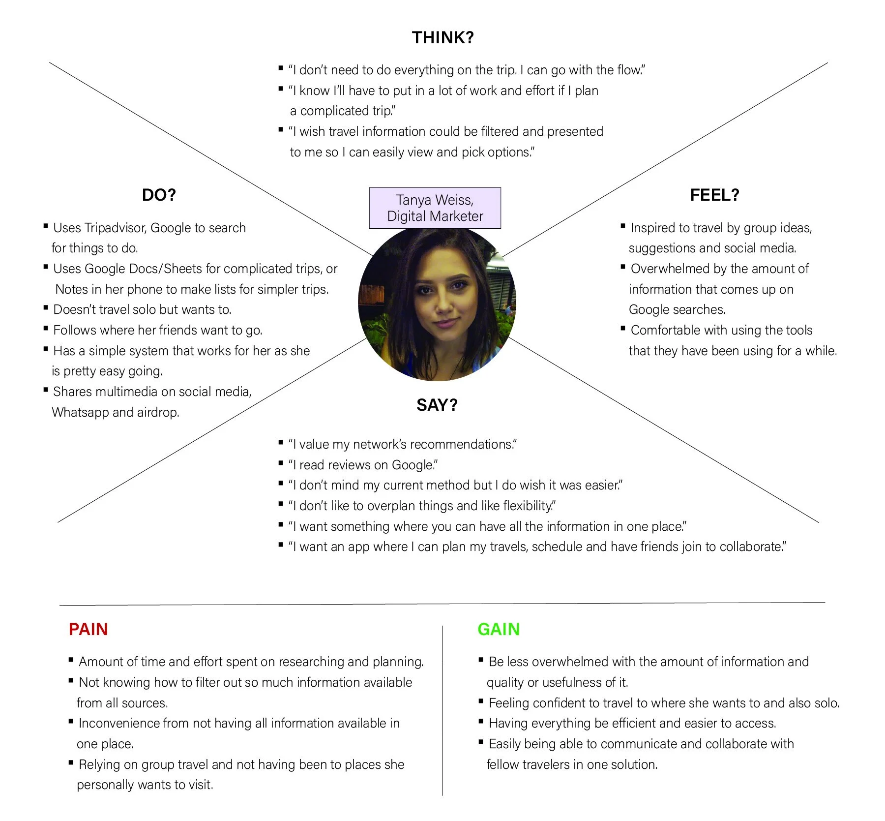
Empathy Map for User 2: Tanya Weiss - The ‘follower’ in travels
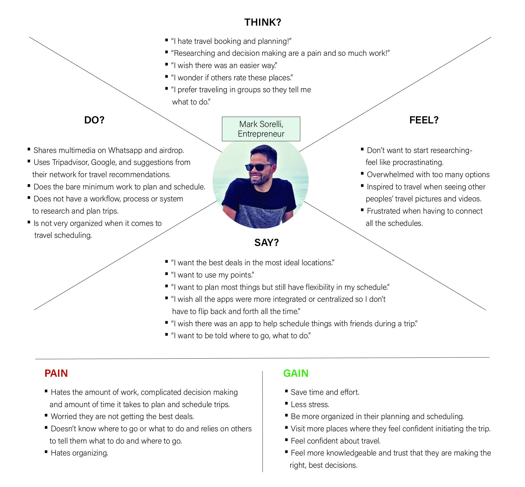
Empathy Map for User 3: Mark Sorelli - The traveler who hates organizing travel
Personas.


‘How Might We’ Statements.
The primary research and data synthesis helped define themes and insights identifying problem areas that posed challenges for my target user group when it came to researching and organizing travel planning. After writing them as insight statements, I reframed the most important ones as How Might We questions to turn those challenges into opportunities for design.
I prioritized the most important insights by the number of times the problem was brought up by users during interviews, and their body language and words revealing the significance or magnitude of these frustrations.
The problem statements identified following the primary research user interviews were:
How might we centralize travel information from different sources to allow for easier and efficient decision making?
How might we help people who hate travel planning to contribute their opinions in group discussions?
How might we help people planning group trips to collaborate on itineraries and sync their schedules, share ideas and files?
How might we make itineraries easy to read, edit, access and share?